The Best Colours for a Café Fitout: Insights from Commercial Design and Fitout Experts
Designing a café involves more than just selecting furniture and arranging the layout. One of the most critical aspects is choosing the right colours for your commercial fitout. Colours can significantly influence the ambience, customer experience, and even the perceived quality of your café. As commercial design and fit out experts, we’ve put together a guide on the best colours for your café fitout to ensure you create a welcoming and memorable space.
Why Colours Matter
Colours have a profound psychological impact on people. They can evoke emotions, stimulate appetite, and even affect how long customers stay in your café. Here’s how different colours can influence your café’s atmosphere:
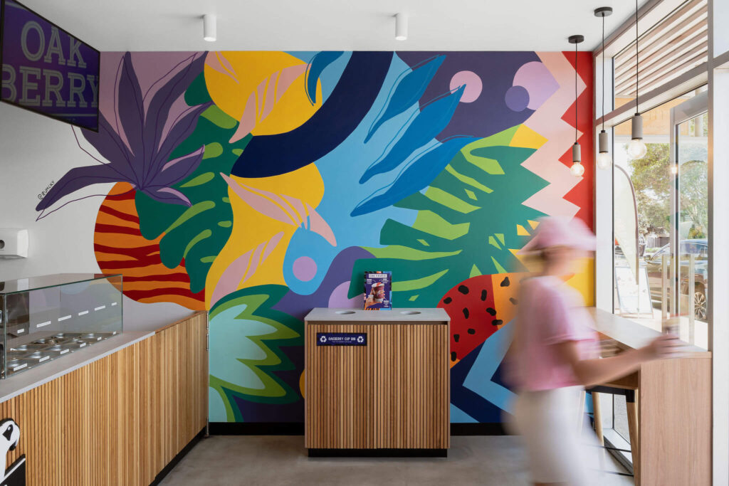
- Warm Colours (Reds, Oranges, Yellows): These colours are known to stimulate appetite and create a lively, energetic atmosphere. They are perfect for cafés that want to promote a vibrant and bustling environment.
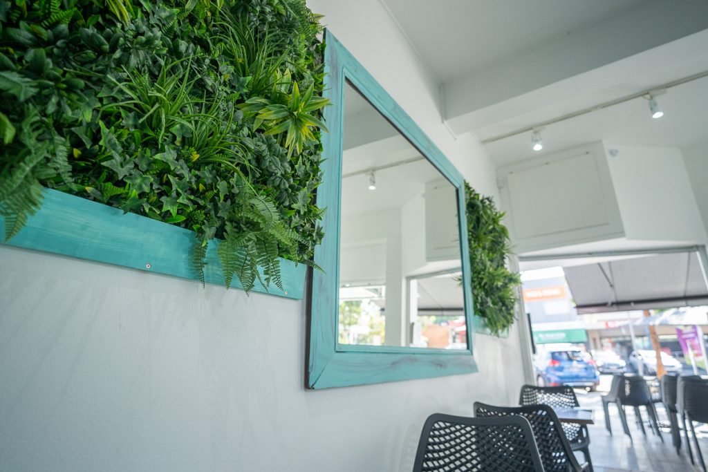
- Cool Colours (Blues, Greens, Purples): Cool colours have a calming effect and can create a relaxed, serene ambience within a commercial fitout. These are ideal for cafés aiming to offer a peaceful and cozy space for customers to unwind.
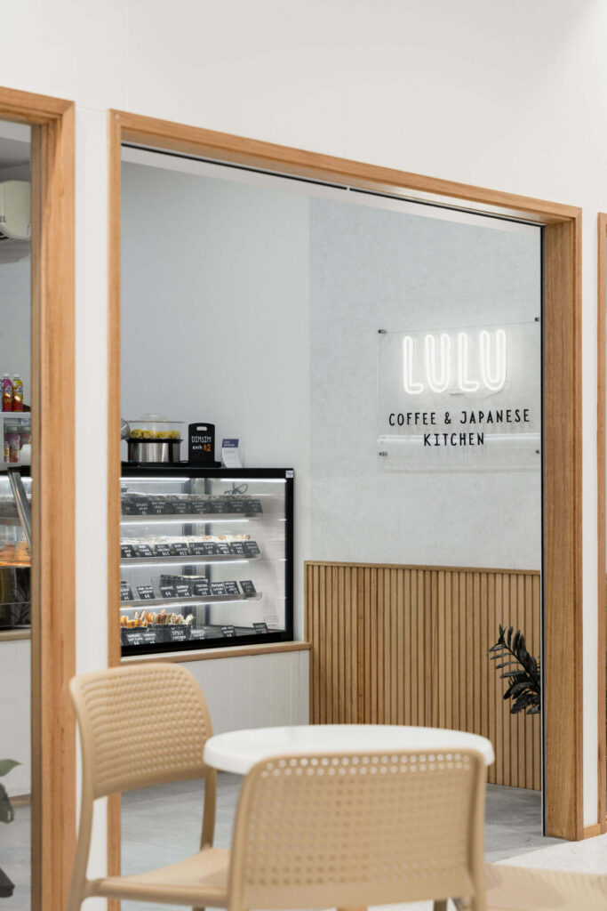
- Neutral Colours (Whites, Greys, Beiges): Neutrals provide a clean and sophisticated look. They are versatile and can be paired with any other colour to create a balanced and harmonious environment.
Best Colour Combinations for Cafés
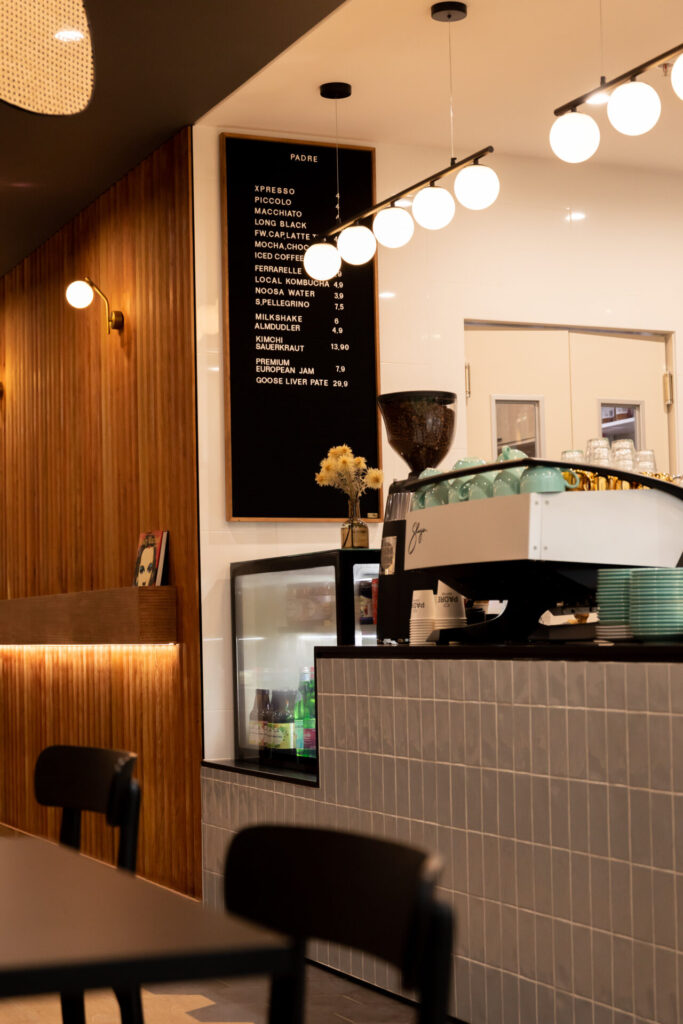
1. Earthy Tones with a Splash of Green
Earthy tones like browns, beiges, and soft greens can create a warm and inviting atmosphere. Pairing these colours with natural materials like wood and stone enhances the cozy and organic feel of the commercial fitout. Adding plants or green accents brings a touch of nature indoors, making the café feel fresh and vibrant.
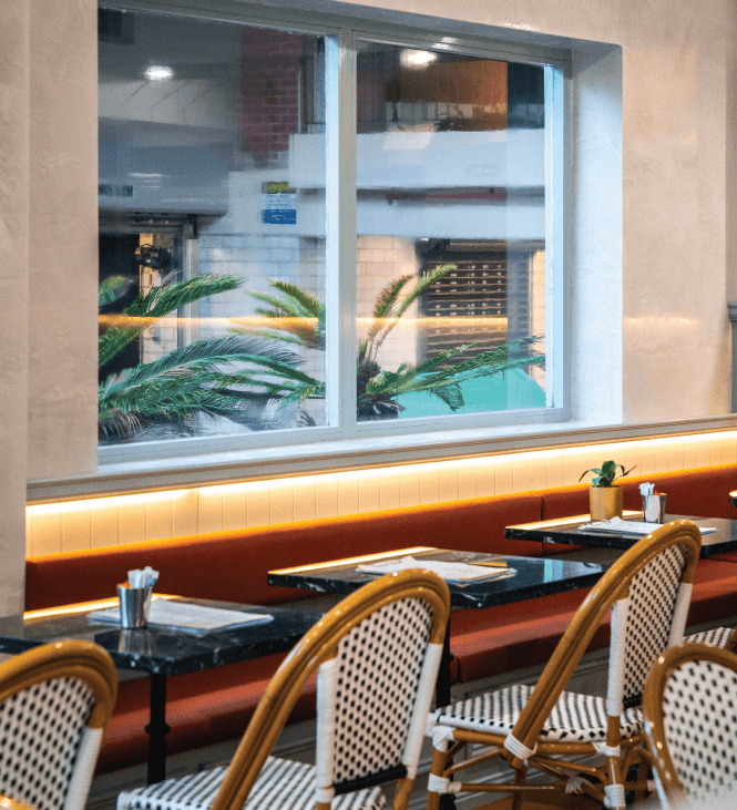
2. Bold Reds and Yellows
For a lively and energetic café, bold reds and yellows are excellent choices. These colours can stimulate conversation and create a dynamic environment. Use them as accent colours on walls, furniture, or décor to add a pop of vibrancy without overwhelming the commercial hospitality fitout.
3. Soft Blues and Whites
If your café fit out aims to provide a serene and tranquil space for customers, soft blues and whites are the way to go. These colours can make the space feel airy and open. Pairing them with natural light and minimalistic décor can enhance the calming effect.
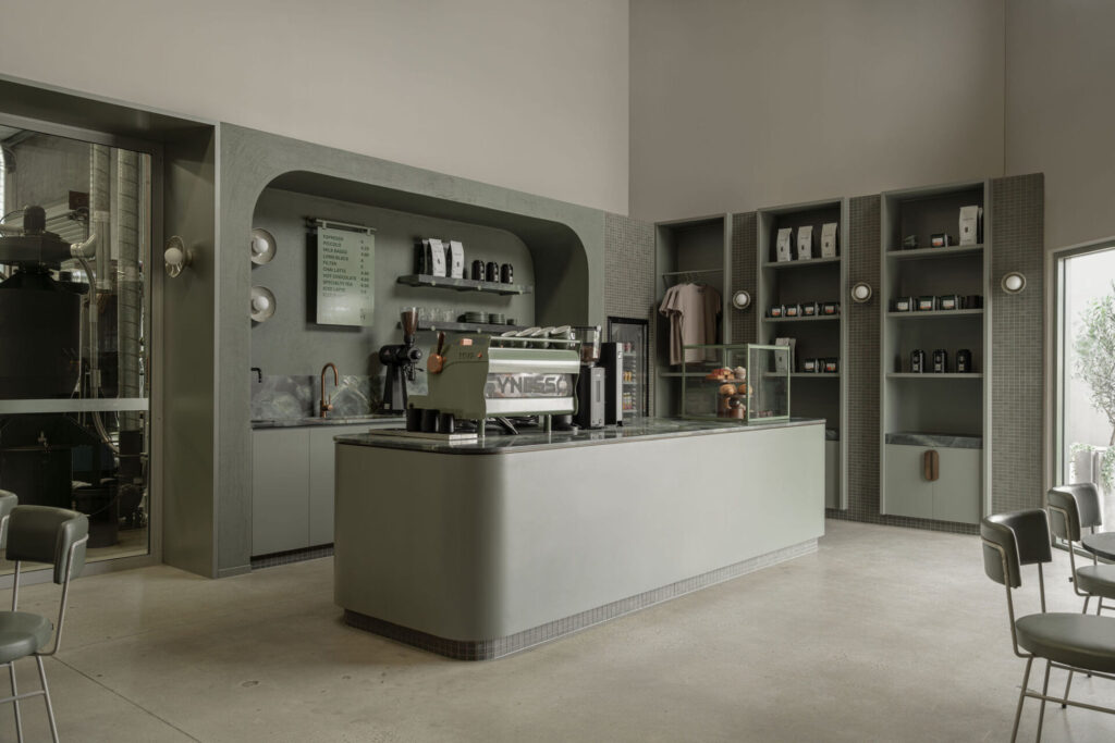
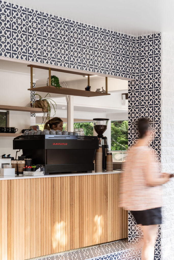
4. Chic Greys and Blacks
For a modern and sophisticated look, chic greys and blacks are perfect within your commercial fitout. These colours create a sleek and elegant ambience. Use different shades of grey for depth and contrast, and incorporate black as an accent colour for a bold statement.
5. Playful Pastels
Pastel colours like light pinks, blues, and yellows can create a playful and cheerful environment. These colours are great for cafés targeting a younger crowd or those wanting to project a fun and whimsical vibe. Combine pastels with quirky décor and unique furniture pieces for a standout look within your commercial hospitality fitout.
Tips for Choosing the Right Colours
Consider Your Brand: Your café’s colours should reflect your brand’s personality and values. Think about what message you want to convey and choose colours that align with that message.
Think About Your Target Audience: The colours you choose within your commercial fitout should appeal to your target customers. For example, a family-friendly café might use brighter, more cheerful colours, while a high-end coffee shop might opt for more subdued, sophisticated tones.
Balance is Key: While it’s tempting to use your favourite colours, it’s important to maintain a balance. Too much of one colour can be overwhelming. Use accent colours to add interest and variety.
Test Before Committing: Before finalising your colour scheme, test the colours in your commercial hospitality fitout. Paint small sections of the walls and see how they look at different times of the day and under different lighting conditions.
Choosing the right colours for your café fitout is a crucial step in creating an inviting and memorable space. By understanding the psychological impact of colours and carefully selecting combinations that reflect your brand and appeal to your target audience, you can design a café that not only looks great but also enhances the overall customer experience. As commercial design and fit out experts, we’re here to help you make the best choices for your café’s success.
Looking to start your next commercial café fitout? Inquire with us today.


